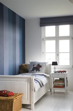
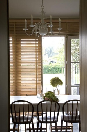
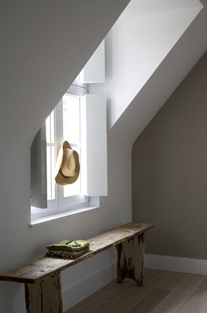
Lefèvre Interiors projects we are working at

Some of my readers asked me when I would be able to post about some new projects of Lefèvre Interiors. Well, the past months, Jan and me were so busy preparing and installing a lof of our projects! The whole process of a design project, from the start to the finishing touch (furnishings, window treatment and decoration included) takes a few months, sometimes even a year!

We are only a small company, where the execution of cabinetry and paneling requires a lot of handicraft and craftsmanship.

Taking all the required measurements and preparing the design renderings and technical plans is a very important phase of the process.

If the plans are approved by our clients, the woodwork has to be constructed by the employees in our workshop.

I thought you might be interested in these projects. So today I show you pictures of some of the projects we were working at the passed months, and which are already installed at our client’s home, but not finished yet.

Painting and docoration has to be finished in the next weeks or months.

But maybe now you will understand how busy I am sometimes and therefore not having plenty of time left to blog!

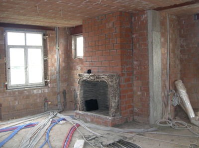
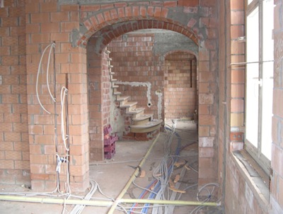
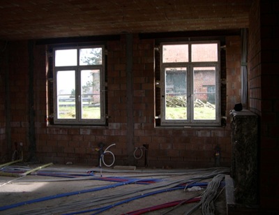
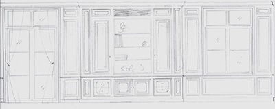
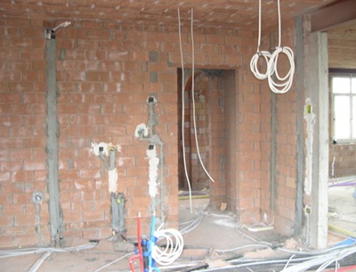
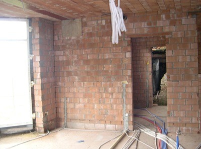
At this project here, we were asked to design a living room with adjoining kitchen.

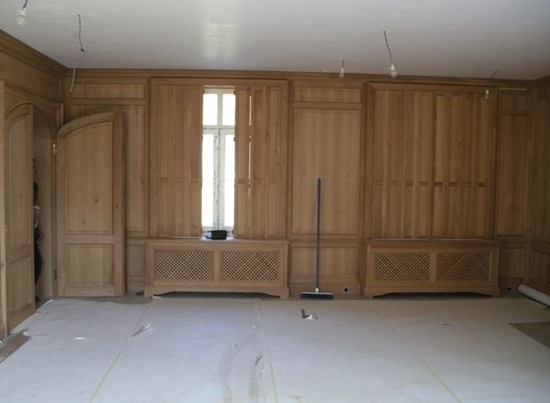
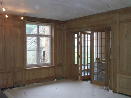
14Oak paneling.

19 Before.

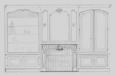
Scannen0067 My very first sketch.

27

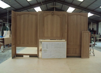
Construction in our workshop.

28

16 Integrated double door to the entry hall.

18 Before.

15 Radiator covering and window shutters.

Scannen0068First sketch.

25 Before.

17 Built-in cabinetry.

Scannen0069First sketch.

8 Double glazed door towards the kitchen.

29 Before.

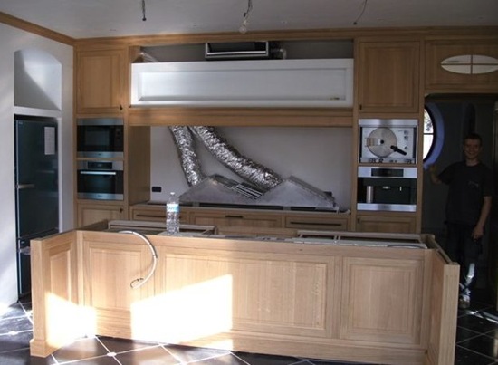
11 Kitchen.

10 Double glazed door towards the living room.

9An almost finished kitchen isle of which the counter top will be made of the Belgian marble “rouge belge”.

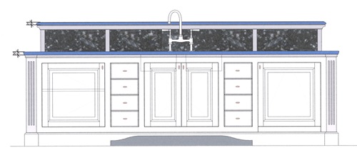
Scannen0072Jan’s technical plan of the kitchen isle.

20 Before.

12This kitchen cabinet is fantstic! I just love this. Do you notice the open parts to store the cutlery?

30 Before.

___

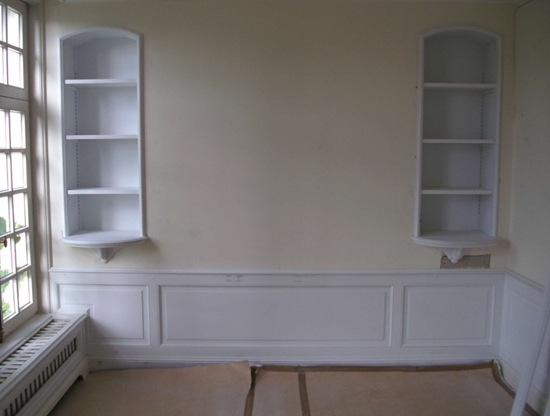
The second project is the redo of a bedroom.
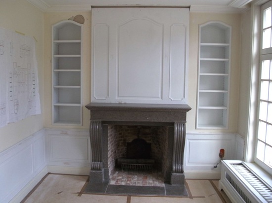
3 All of the woodwork in this room has to be painted.

6 Before.

4 Built-in cabinets as a French “placard”.

5This is the bedhead wall.

___

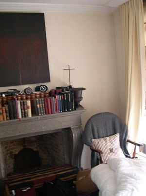
A third project is about a redo of a library room.

21

This cabinetry and paneling is also made of oak but with a totally different finish than the oak at the first project I showed you.

This library need to be furnished and decorated now.

___

This is also a redo project of a library room.

2 For this project we used French walnut for the cabinetry.

I will show you more pictures of the room when the window treatment is finished.

___

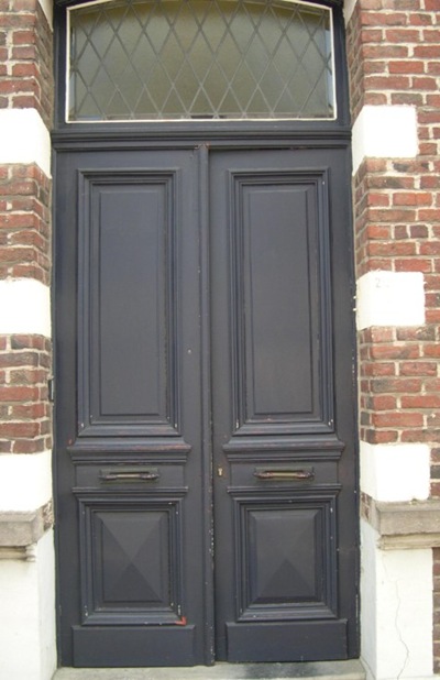
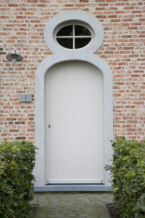
And finally, the remake of an existing front door!!!

This is a rather unusual project but the owners of this house couldn’t find no one who was prepared to make this door with the exact profiles and proportions of the 19th century authentic door.

Jan and me decided to go for it and the owners are now very pleased with it.

24

The new front door. (So sorry I didn’t have a better picture of it.)

Unfortunately we had to change the design of the letter boxes, because the original ones are not conform anymore to the new legislation about the required measurements of mailboxes.

22

The old damaged door.

23

___

I will asap post pictures of the finishing part of these interiors, furniture, window treatment and decoration items included!

xx

Signature

All pictures by me.

You have read this article Boiserie / Lambrisering / Lefèvre Interiors / Wood paneling with the title January 2011. You can bookmark this page URL http://carteirodopoente.blogspot.com/2011/01/lefevre-interiors-projects-we-are.html. Thanks!

Weekend News


KIM CLIJSTERS WINS AUSTRALIAN OPEN FOR THE FIRST TIME !!!

Kim Clijsters

Congratulations Kim! We are so proud!!

___


AXEL VERVOORDT OPENS ART GALLERY IN ANTWERP

Axel VervoordtGunther Uecker “Black Rain”

source : http://www.axelvervoordtgallery.com


In the Vlaeykensgang, located in the city centre of Antwerp, Axel Vervoordt opens a new exhibition space.
He will focus on the ZERO and the GUTAI art, an international movement of the sixties, who sought harmony between man, nature and technology in which light played a dominant role.
For more information : www.axelvervoordtgallery.com

___


Wish you a wonderful weekend!

xx

Signature

You have read this article Arts / Axel Vervoordt / Kim Clijsters with the title January 2011. You can bookmark this page URL http://carteirodopoente.blogspot.com/2011/01/weekend-news.html. Thanks!

The sophisticated classically modern design of Jamie Herzlinger Interiors & The peace-ful rural homes of At Ease Interiors


Jamie Herzlinger Interiors is a nationally renowned Interior Design Firm as well as a leading custom home building company, specializing in high end residential, with offices in New York, Scottsdale and Tucson.

Jamie Herzlinger is a designer who blends diverse elements, periods and cultures to create a sophisticated intercontinental environment.

JH 16Jamie Herzlinger

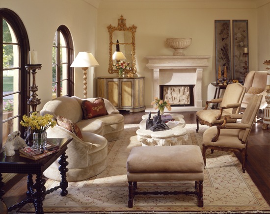
Her design style is inviting, yet elegant and luxurious, and above all irresistibly comfortable.

“To me, a home’s aesthetic should draw on diverse influences within a particular style. One’s home should be beautiful, exciting, thought provoking and emotionally accessible.” explains Jamie at her website.


JH 10

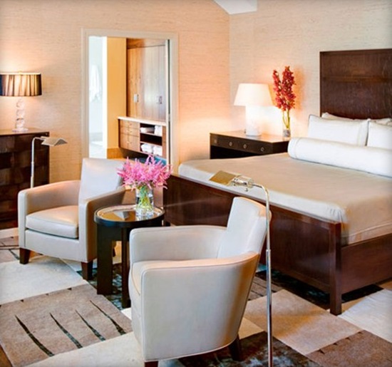
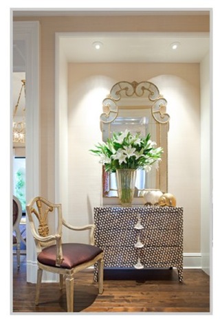
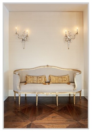
I love all of the seats, especially the design of the armchairs, Jamie has chosen for this room.


JH 9

Very classy!


JH 2

Sophisticated!


JH 3


Intercontinental environments…

JH 4

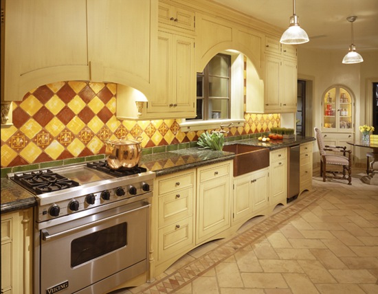
…as you notice here at this kitchen with the French provencal influences.


JH 5

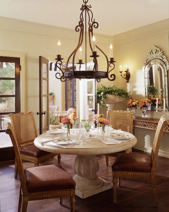
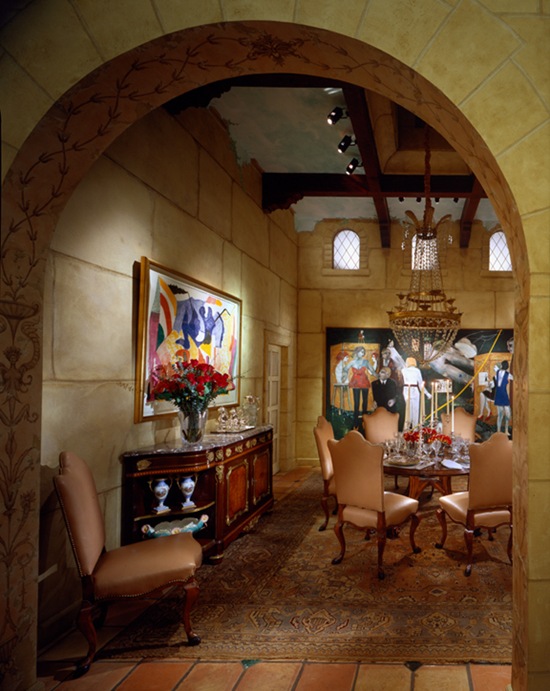
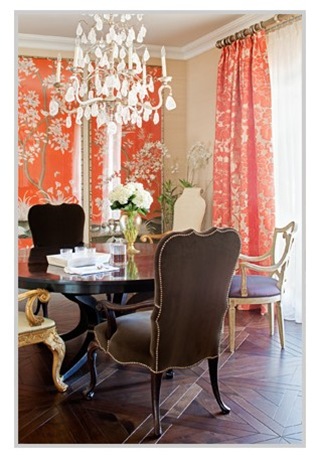
Or in this Italian styled dining room with its gorgeous Italian chairs.


JH 6


JH 7 

JH 8

This is one of the houses built by Jamie Herzlinger home building company.

JH 13

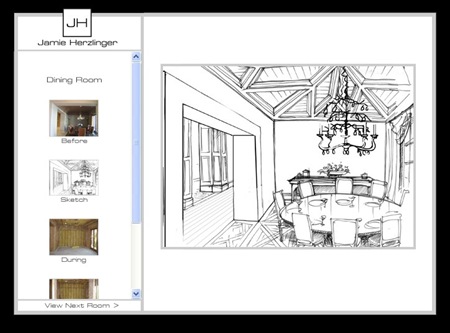
JH 14 JH 12  You really have to go to the renderings page, of Jamie’s website where you will discover some beautiful renderings together with “before and after” images of some of Jamie’s pojects.

JH 11


To visit Jamie’s blog : click HERE.

To see more of Jamie’s gorgeous interiors,

please visit her website by clicking on logo of Jamie Herzlinger Interiors.

JH 15

___


A second designer I want you to meet is the Belgian designer Bieke Pittoors, owner of At Ease Interiors.

At Ease Interiors is a unique concept, that has grown out of Bieke’s hobby to  her true passion : helping her clients to build a house and create a warm, peaceful home where you immediately feel ‘at ease’.

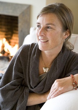
AE 17Bieke Pittoors

Bieke creates welcoming and warm rural homes with character.

“My goal is to help to create a warm and nice home, where, after the rush of the day, you can relax in a cozy, homely atmosphere.” explains Bieke at her website.


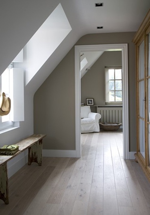
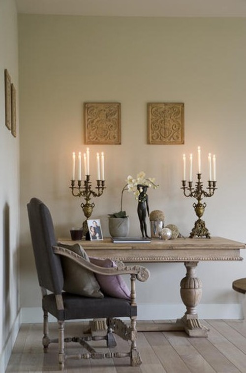
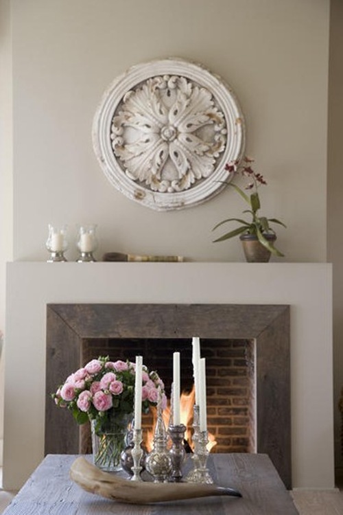
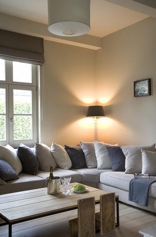
My readers, who are following my blogposts over the last year, will definitely recognize a lof of the characteristics of the Belgian rural design style at these images of Bieke’s work.

So enjoy!

AE 1

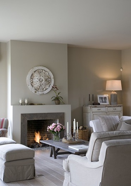
Subdued color palette and Belgian linen upholstered seating.


AE 14

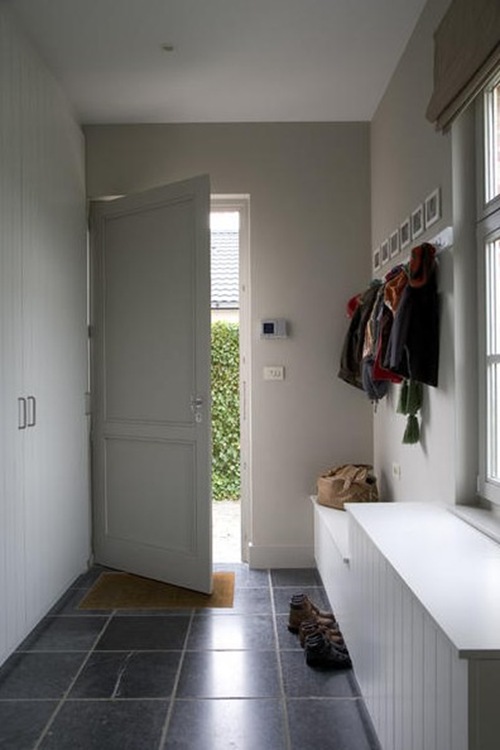
Belgian blue stone floor.


AE 12

  Very peaceful and relaxing atmosphere.


AE 5

Well chosen decorative items.


AE 4 

AE 6

Notice these wooden children’s chairs!


AE 15


AE 9

AE 3

AE 13

From the first construction or renovation plan or specific to that one decorative object, Bieke is willing to listen to you.

AE 10

AE 7

AE 8

If you wish to invoke Bieke’s services, you are always welcome to visit At Ease Interiors by appointment or contact Bieke HERE.

To discover more of Bieke’s Belgian design style, please visit her website by clicking on logo of At Ease Interiors.

AE 2

___

I hope you enjoyed this post about these fabulous Interior Designers.

xx

Signature

Image source Jamie Herzlinger :  Jamie Herzlinger & http://www.jamieherzlinger.com

Image source At Ease Interiors : http://www.ateaseinteriors.be ; Photo credits : Bieke Claessens

You have read this article American Design / American interiors / Belgian Design / Belgian interiors with the title January 2011. You can bookmark this page URL http://carteirodopoente.blogspot.com/2011/01/the-sophisticated-classically-modern.html. Thanks!