Do you know that feeling when you see a picture of a dining room or a living room or a kitchen of which you can’t keep your eyes of? Well that happened with me looking at these kitchen images. They all have that little bit more…! Definitely to me!
Enjoy!
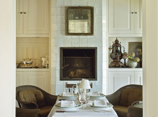 image source here
Wouldn’t you love to be invited to have dinner in this kitchen? I certainly would !!!
Last week I discovered a beautiful blog of 2 lovely ladies, Renee and Angela. The blog UNDER SPANISH MOSS . My dear friends, I really want to advice you to visit this gorgeous blog! Although Renee and Angela started their blog not so long ago, it looks very promising. You will find the most beautiful images of architecture and interior design.
Browsing through this blog, I came across these beautiful kitchen pictures that Angela and Renee posted, talking about the architect Kevin Harris HERE. I might think that you will all love this blog!
http://underspanishmoss.com
I couldn’t resist to show you 2 of the pictures of this Tuscan inspired kitchen by Kevin Harris.
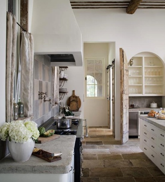 image source : Kevin Harris
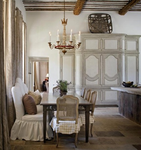 image source : Kevin Harris
To die for, isn’t it?
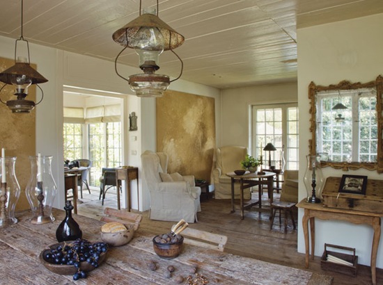 image source here
Coming home after work to relax in this kitchen?! No doubt!
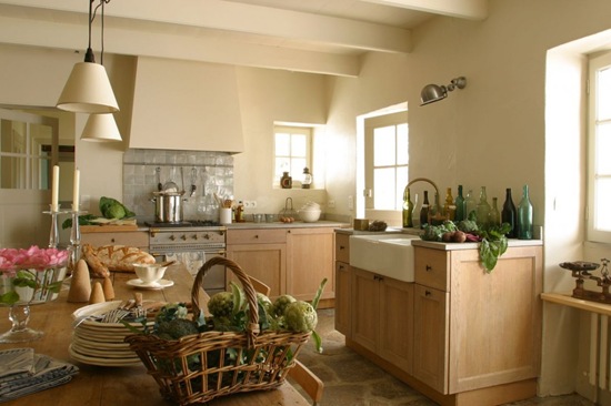 image source : here
Soft and creamy.
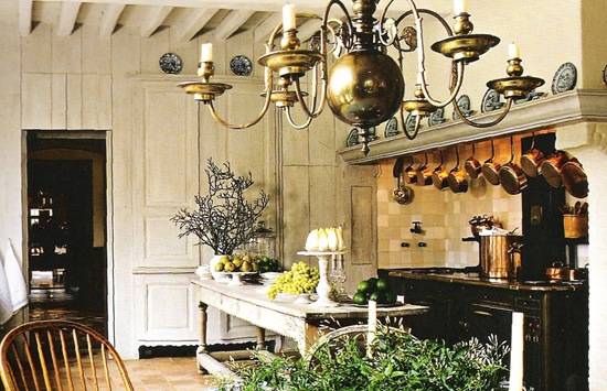 source : unknown
Notice the way that cabinet is integrated in that kitchen wall.
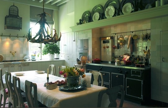 image source : here
I have always loved the entire tiled kitchen walls with “Hollandse witjes”. Don’t you?
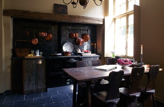 Kitchen of Guesthouse Bonifacius Bruges
This is a picture of the kitchen of the guesthouse Bonifacius in Bruges! A wonderful place to stay if you ever visit Bruges! Take a look at the website : http://www.bonifacius.be/. You will not regret it!
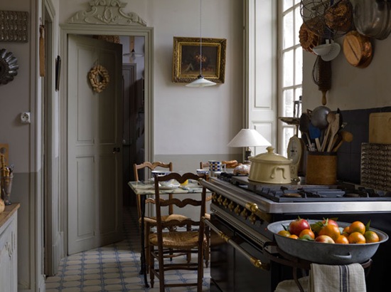 image source here
French inspired! Always charming.
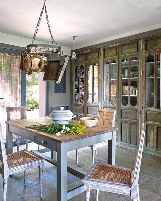 source : unknown
Gorgeous built-in cabinet with antique doors.
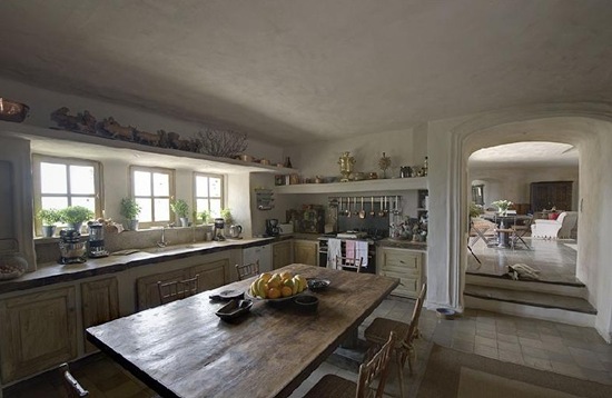 source : unknown
I love the wall finish here.
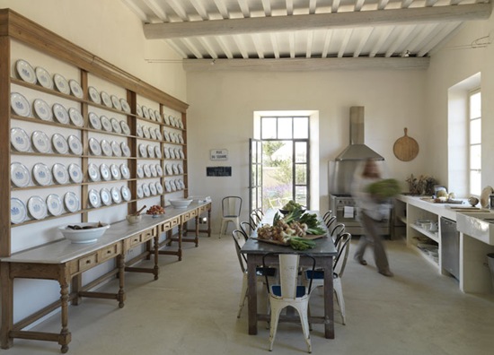 source : unknown
I do love everything about this kitchen!
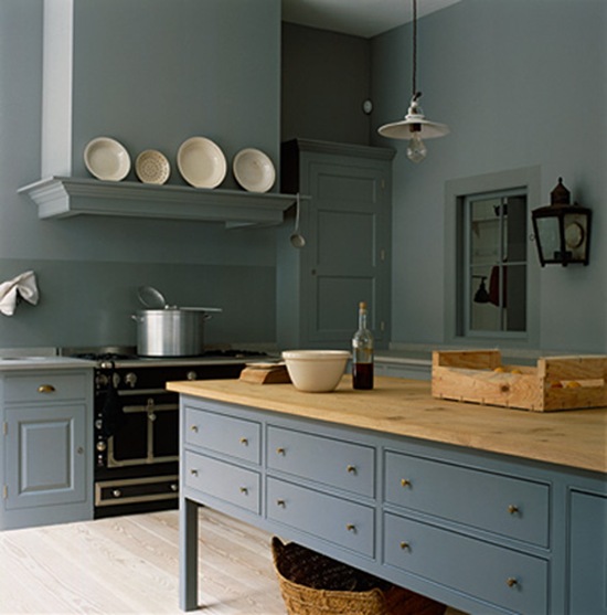 image source : here
Isn’t that a wonderful blue-gray color? Notice the plank floor and that stunning wall light here.
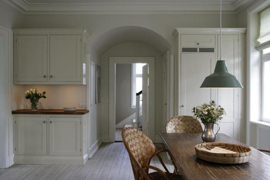 image source : here
Beautiful combination of the white cabinets with the stained table and lovely kitchen chairs!
Since I have discovered the kitchen of Susan, the author of the blog TWO MAISONS , I filed the pictures because I just looovvveee this kitchen! No clutter and so airy.
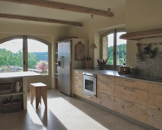 The old cheese planks that Susan used for the kitchen cabinet doors and drawers are fabulous!
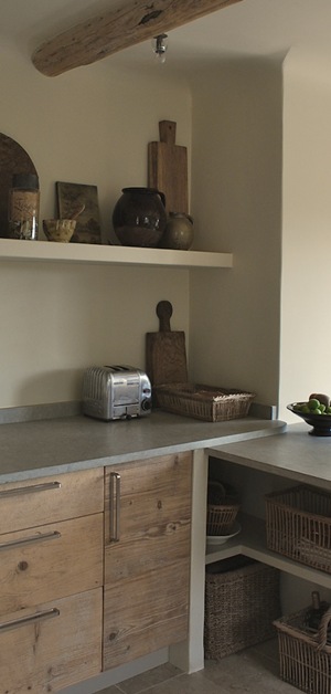 Notice the wooden beam!

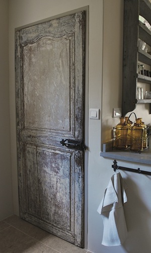 And that beautiful 18th century French pantry door of which Susan scraped off the paint inch by inch!
To read the before and after post of Susan’s beautiful kitchen, click here .
___
Talk to you soon! In my next post I will show you the pictures of our finished orangery redo!
xx

Sorry for the unknown image sources. If anyone can tell me the source, please let me know. I will be pleased to adjust it on this post.
You have read this article Kitchens
with the title March 2011. You can bookmark this page URL http://carteirodopoente.blogspot.com/2011/03/kitchens-with-that-little-bit-more.html. Thanks!




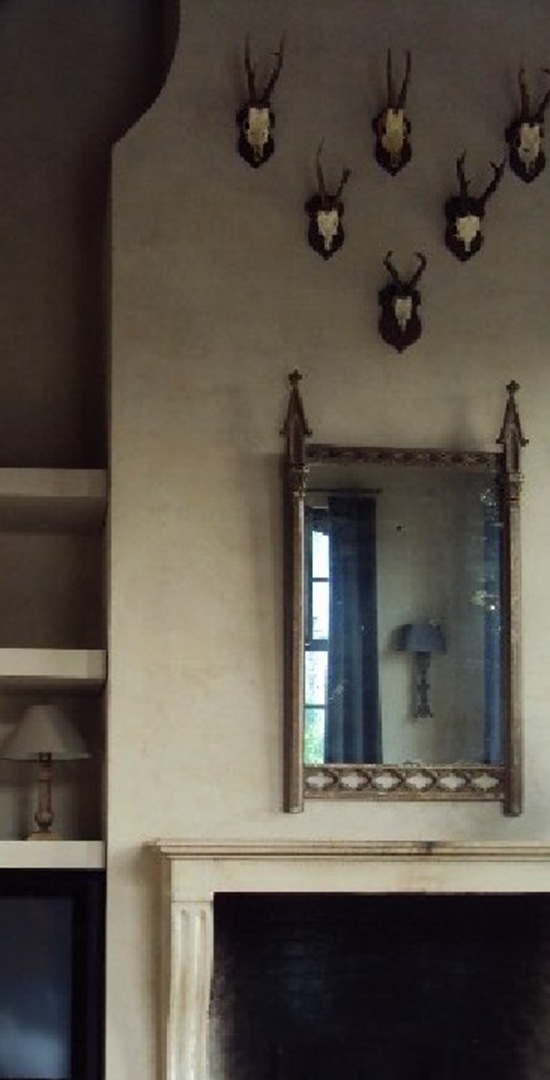

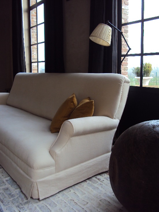

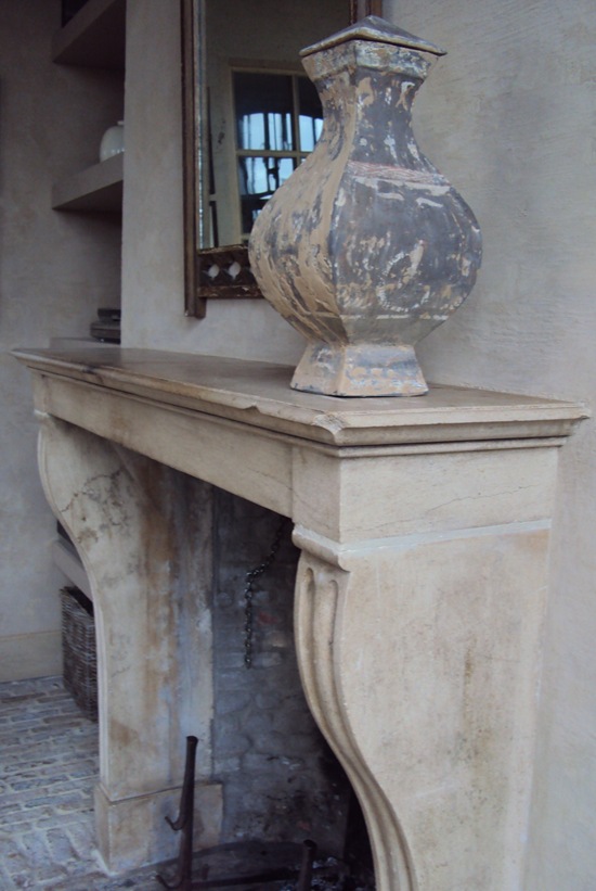
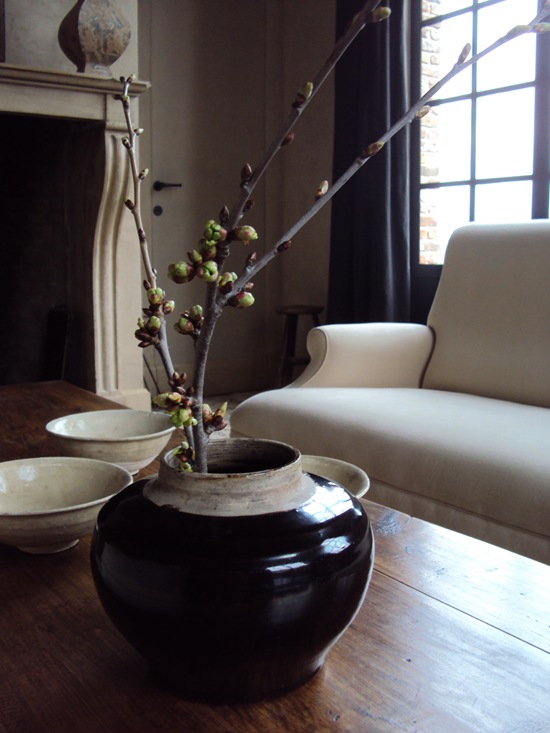


 source : unknown

 image source :


![1_thumb[1] 1_thumb[1]](https://blogger.googleusercontent.com/img/b/R29vZ2xl/AVvXsEjJ8K8bY-1tSwNU9mc9npvtUaZgohR8hJdQGiiFa5a4IKv33Frz3mF7Oh8kEYWTos2QAW4sXxQHEteQwj_jHZQy5ALT2Ds-5nyxYJGg-RCyUmpmdD1virJOQSpAD0cMqt0ZHsfjPD7T23U/?imgmax=800)
